 Being a thought leader in your industry is critical to supporting and expanding your brand. The strongest brands are those owned and managed by thought leaders. That’s because thought leaders understand that there are key building blocks enabling their position.
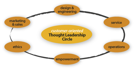
Thought leadership building blocks:
- Design & engineering (product/service, process, store, graphics, interactive)
- Marketing & sales (multichannel media, sales methodology)
- Service (phone, online, social media, mail, in-person)
- Operations (raw materials, manufacturing, warehousing, delivery)
- Ethics (your brand’s moral compass including aspects such as fair trade, labor practices, environmental responsibility and community support)
- Empowerment (employees, vendors, partners, customers)

The strength of the Thought Leadership Circle is only as good as its weakest link.
A solid network of thought leadership building blocks enables trust in the reputation of your brand. Imagine a perfect circle made of building blocks surrounding your customers. As the thought leader in your category, you must continually excel at all of the above to prove your leadership worthiness. Any misstep impacts your position and ultimately, your brand’s integrity.
In this article, we’ll review the design component of thought leadership.
Using Design As A Thought Leadership Building Block.
Looking the part of the thought leader ensures your customer pays even closer attention to what you say and do. For example, let’s look at IKEA, arguably THE thought leader in the modernist home furnishing market.
IKEA spent the past 50 years building its reputation as THE expert in affordable modern design for the home. Going way beyond just designing modern products, IKEA modernized the process of buying home products and designed stores that include everything for the home. They managed to instill a global and modern design sense in every aspect of their business, thus building the ultimate modern brand. IKEA is the thought leader of modernist home furnishings. It is the go-to expert if you want affordable, cool, modern stuff for your crib with that special IKEA shopping experience.
But, and you knew there was a ‘but,’ right?
Very recently, IKEA enlisted in a rebranding project and as a result, changed its corporate typefaces from their customized versions of Futura and Century Schoolbook (a.k.a. IKEA Sans and IKEA Serif) to Verdana. The objective was to unify the company’s online and print typefaces to save costs on global implementation. While a respectable goal, this brand maneuver is resulting in a huge outpouring of criticism in the blogosphere, Twitterverse, newsfeeds and online forums, ultimately questioning their future position as thought leader for modern home furnishings.
Why Is This Even an Issue?
On the surface, this may not seem like a big deal. But what IKEA failed to take into consideration is that the typography component of design is a method by which we express the brand’s voice, and a significant portion of their customer base is design-centered. Most of the commentary critical of this change focuses on the future:
What does this mean for IKEA’s position as modernist thought leader?
Who will they turn to for leadership in affordable furnishings for their homes?
Who do they trust?
To better understand why this venture is risky, let’s first review a little background info on the three typefaces and their applications:
- Futura is a modernist typeface designed during the Bauhaus years and uses the perky geometric forms of that day. Because of it’s geometric and modern design, Futura is often used for both display and body text applications. IKEA Sans is a slightly customized version of Futura designed by Robin Nicholas.
- Century Schoolbook is a serif typeface based on research that showed young readers more easily identify letterforms that used contrasting weights. It also has a larger x-height and slightly increased tracking to further improve readability at smaller sizes, making it perfect for body text where it enhances communication. This feature is so critical that the Supreme Court of the US requires briefs to be typeset in Century.
- Verdana, designed by Matthew Carter in 1994 for Microsoft, served a very specific application: on-screen use in websites. Verdana includes features that make it more legible on backlit monitors including: larger x-height, added tracking and enhanced pair kerning. It is the extra tracking and padding that make Verdana inferior for print use. As a display headline, all that padding and special kerning requires adjustment downward to increase readability. Thus, using Verdana in print actually makes more work for the print designer.
Typeface usage falls within two traditional categories and one new one: display, body and screen typefaces. Display fits larger needs such as headlines in ads and text on outdoor billboards. Body faces are appropriate for smaller text such as paragraphs and captions. Screen faces are exactly that, faces that increase readability on computer monitors or overhead projectors.
Yeah, Yeah—Get to the Point.
Most consumers don’t purposefully think about the exact ingredients that go into the products they buy or the brands they love. They don’t think about the thickness of steel on the body of a Mercedes or the method by which Mercedes applied the paint. They just know that it’s the color they want, it looks good and they trust that the engine won’t fail them. But if the paint job were flawed, you can bet they’d notice it immediately, and the integrity of the Mercedes brand is then open to debate. This is a great example of the invisibility of good design and engineering.
Likewise, Futura reflects the modern IKEA product ‘design equals function’ aesthetic and reinforces their modernist thought leadership position even though consumers don’t directly think about it each time they open the IKEA catalog. Century Schoolbook reinforces that modernism while increasing readability in body text and again, consumers don’t directly think about just how easy it is to read the tiny type in the catalog. It all just works and looks good.
Verdana is arguably the best sans-serif typeface for use on websites, its specific design purpose, but it has no basis in print. Typeface selection, along with color, imagery and other seemingly aesthetic design choices, directly affects functionality and has the power to affect our emotional connection to a brand, thereby playing a key role in maintaining the thought leadership position of a company.
While functionality is obviously measurable, the emotional connections are harder to attribute to design. This is why corporations, even IKEA, so often overlook them.
So, is IKEA thinking ahead of the curve or are they driving blind?
“Design is no longer just about form anymore but is a method of thinking that can let you to see around corners.”
Bruce Nussbaum
Editor, BusinessWeek’s innovation and design coverage
Very few corporations understand that good design plays a key role in building a thought leadership position. For example, companies like Apple, Target and Trader Joe’s all use design as a method of creating and retaining their respective leadership positions. Companies that pigeonhole design as marketing department fluff are not taking full advantage of their thought leadership tools.
IKEA became the thought leader in modern home furnishings by integrating design as a key brand-building component. It will be interesting to see what happens next.
By Julia Moran Martz


