About Julia Moran Martz

http://www.mondovox.com

Julia Moran Martz is Partner and Co-Creative Director of MondoVox, Inc. and has 29 years experience in communications and design solutions for consumer products, life science, technology and consulting companies, as well as management and business development experience in technology and dotcom sectors.

Posts by Julia Moran Martz:

Making Sure Your Corporate Brochure Doesn’t Stink.

If you believe that a typical corporate brochure is a one-off piece containing all the minutiae associated with a company, that costs way too much money and that no one ever really reads, you’re right. ROI for most corporate brochures is hard, if not impossible, to track. Many brochures don’t have a call to action let alone a method for determining effectiveness. They’re not integrated with other marketing or sales initiatives. They have no links to other tools. No means of continued engagement. They’re failures and budget suckers.

And yet, some corporations diligently print their corporate brochure every year or two and see nothing wrong if they can’t attribute any value to the exercise. After all, corporate brochures are part of the cost of doing business, right?

Stop the Madness! Let’s look at strategies for creating a more successful brochure.

Wallflowers Don’t Get Asked to Dance.

Most corporate brochures don’t get read because they’re boring. They don’t even get looked at because they’re unattractive. Boring + unattractive = waste of marketing $$$.

There are a few that succeed. These have:

  • A clear focus.
  • Enthralling stories.
  • Engaging formats.
  • And often are fun to read and share.

Insanely awesome corporate brochures also integrate – in a meaningful way – into your overall marketing effort. They are not standalone pieces mailed to customers and stakeholders ad nauseam. There’s no reason why your corporate brochure can’t be a start or continuation of an ongoing dialog between you and the world. Shoot, you can even integrate your print brochure into social media by using it to start a Twitter dialog and vice versa. Bring up issues. Start conversations.

What you don’t want to do is use this piece to simply list your equipment or services. Just because it’s a brochure doesn’t mean it’s a one-way communication tool. Integrating a brochure into the dialog chain makes it a more effective tool and more likely to be shared.

If the Story’s Too Big, Chunk It.

If so much happened in your company this year, consider creating several mini-corporate brochures. This does two things:

  1. Doesn’t overwhelm folks with too much info at once.
  2. Provides an opportunity to continue the dialog over time.

It’s About People, People!

Keep in mind, everything related to your company is also about people and their stories. No one wants to see more widgets even if your widgets are better. That’s the job of your product catalog. What people want to know is, “how do your widgets affect people like me?” A testimonial best tells the story. Something prospects can relate to.

Invest in good photography of real people. Remember, real people trump 20-something models. And just because you’re using real people doesn’t mean you should use your 19-year-old nephew as a photographer because he’s taking a journalism class. Good people photographers know how to make regular folks look good. Awesome people photographers also know how to tell a story.

Proof is in the photos. Even though everyone knows that anything can be Photoshopped, there’s still an enduring trust in the photographic truth over words or hearsay. If you’re a 5-star hotel with THE best facility, back up your claim with photos. If you’re known for having the happiest clients in the industry, show me. Anyone can write a testimonial and have your client sign off on it. But when your client allows inclusion of a photo – well, that’s commitment and trust.

Look Good While Teasing.

Your corporate brochure is not an encyclopedia for your company. Hold back key information so folks have to talk to you to get more. Invite them to ask questions. Better yet, make them WANT to know everything about you. Divulging too much upfront allows prospects to make a decision without getting to know you better. Use your corporate brochure like bait; make them want you and beg for more.

Surprise, Surprise, Surprise!

Put your best foot forward by investing in the best design and printing you can afford. And make it engaging. Surprise folks. Do something with your brochure that’s unexpected and worthy of conversation.

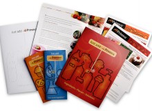
Here’s an example: A printer I know just sent out an engaging corporate brochure to create awareness of their environmental commitment. Yeah, yeah, everyone’s on the environmental bandwagon but this is my point! What engaged me about this brochure was that it very obviously wasn’t like all the other environmental corporate brochures in my mailbox.

This particular printer’s brochure tells the environmental story at a personal level by using photos of real employees being supervised by animals. Yep, animals. The notion that this printer is partnering with nature is bodaciously announced on page one as a corporate merger with nature, further ‘proven’ with entertaining shots of employees and animals working side-by-side. The fact that the animals in the shots are plastic lawn ornaments just makes it all the more entertaining and fun to read. (Along with the disclaimer that “…no animals were harmed in the making of this brochure but several employees had their dignity completely destroyed.”)

Additionally, the brochure pages are bound peek-a-boo style like those Advent calendars where you open the panel to see the image behind it. Specifics about what they’re doing environmentally are listed succinctly on each page. Overall, the brochure is highly interactive and entertaining while reinforcing the printer’s merger with nature.

All in all, this brochure is a perfect example of when reinventing the wheel is worth the effort. They ended up with a highly targeted vehicle that I feel compelled to share with others.

Keep The Conversation Going.

Too often, corporate brochures fail to start conversions. They also fail to continue conversations because they don’t integrate into other marketing and sales tools. Create a series of printed mini-corporate brochures promoted via email, with requests tracked in fulfillment and invitations to engage via social media tools like Twitter or blogs. You can even start the conversion in the brochure and keep it going and current via your corporate blog.

The trick is to start thinking of your corporate brochure as more than a brochure. It’s a tool rather than a place to document your mission statement and history. It’s a lead in. It’s something that you can use more effectively if you start thinking of it as one small piece of a larger conversation. Only this way will you be able to use it more effectively.

— by Julia Moran Martz

Power Blogging Tips for Your Brand.

Sun Microsystems’ Jonathan Schwartz* is perhaps the most well-known and experienced C-level blogger. Truly self-written, his blog reaches out to employees, analysts, shareholders and prospective clients. Sun also hosts thousands of employee blogs on a wide range of topics, some so geeky your eyes would glaze. This has the added value of attracting top talent with unique and specialized interests and creates invaluable links between Sun employees and customers.

Blog Design and Writing.

  • Brand expression: Integrate your brand look and feel into your blog using a custom theme designed specifically for your brand. You’ll look professional and readers will more easily recognize you. Just remember, your blog doesn’t and shouldn’t look exactly like your website because its purpose is different. Consider your corporate blog your website’s outgoing sister who makes friends easily.
  • Use standard blog interface design principles: Increase usability among blog readers by sticking with what they know and use:
    • Incorporate the topical tags and categories for quick sorting.
    • Include relevant links to other related sites or blogs in the sidebar.
    • Customize your CSS to choose a highly readable font and size.
    • Include your authors’ names.
    • Above all, keep it clean and easy to read.
  • Be unique and useful: That’s the goal. Your brand is about more than product details or specs. Open a dialog with actual buyers of your brand and be prepared to learn, expand and be surprised.
    TIP: Also be prepared for any negative brand feedback. You can moderate reader comments so they don’t appear right away but avoiding negative posts will look bad. It’s also likely to result in brand bashing on other non-moderated forums that you don’t control. It’s best to address criticisms openly and up front in this brave new world.
  • Become a better writer: Communicating in writing is completely different than oral presentations or interviews with a trade journal. Keep your sentence length under control and use the active voice. Additionally, be aware of non-disclosure agreements and financial regulations that guide what you can write. And if you’re uncomfortable writing, you can always have a ghostwriter express your ideas.
  • Be real: Skip the company mission statement and other corporate-speak on your blog. This is about having real conversations with real people. Authentic conversations incorporate everyone’s personalities and engage at a level not possible if you write blog entries in the same voice as your annual report. Writing in the first person helps to naturally encourage authenticity.
  • Have a plan: Most blogs close down in three months. You can ensure the longevity of your blog and readership by enacting an annual editorial plan along with allowing the spur of the moment posts. Make sure the topics planned reflect your company’s product releases, are integrated with your PR releases and have specific people assigned to handle writing and posting.
  • Think like an analyst: Set up a Google Analytics account to monitor your blog and ensure your blog template is search-engine optimized.

*Update: Mr. Schwartz is no longer CEO of Sun Microsystems.

— by Julia Moran Martz

How to Create a Winning Press Kit?

Successful press kits not only deliver timely information to editors but they also make you look and sound credible. Editors can’t risk their reputation on questionable information or sources, so make sure your message is clear and your brand represented.

To create a great press kit you must:

  1. Have something newsworthy
  2. Understand your target editors/writers
  3. Write and design your kit to those editors/writers while supporting your brand

This article focuses on writing and designing a winning kit.

Good Creative Supports Your Goal.

Great press kits go beyond photocopied releases in plain manilla envelopes. They can include digital media and be delivered electronically. They can also include samples or giveaways. Many are downright wacky and fun. But it is a fine line between enough and overkill. Highly innovative and gimmicky press kits may be the in-thing for movie launches and fashion shows, but they could fall flat without the substance to back them up or when editors are focused on widgets or financial services. Be sure your kit is designed appropriately for your niche. If your story requires bells and whistles, by all means, make some noise. Just make sure your kit doesn’t upstage your news. Pay special attention to:

  • Grammar and spelling. Poor grammar and spelling make you look careless and untrustworthy, not to mention a little dim. And for heaven’s sake, don’t rely on spell check. Remember, editors and writers care about dotting i’s and crossing t’s.
  • Kit design. Don’t undermine your brand by tossing simple press releases in a blank folder and calling it a kit. A strong brand that’s consistent within the press kit wins points with editors looking for the next great thing from a credible source.
  • File formats. Make sure your photos are high resolution. It also doesn’t hurt to include both RGB and CMYK since most publications have online components.

Creating a great kit improves your chances of becoming tomorrow’s news.

Getting Front Page Placement.


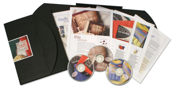
Here’s an example of a press kit that won prime placement on opening day of the annual International Housewares trade show in Chicago—exactly the right day of the year! Although this is example from a very specific niche, the same principles apply no matter what business you’re in.

Out of the thousands of new products introduced at the show, this client’s innovative and elegantly simple table cloths were included in the Chicago Tribune’s list of top 14 innovative products—with photo and above the fold—on the front page of the Home & Garden section of the Sunday edition.

How Was This Accomplished?

Nailing prime placement in key publications is never a sure thing, but it’s more likely with a combination of a great product or service, a great story and a well-done press kit.

What to Include.

Start by using product storytelling, well-written press releases and, if applicable, demonstration videos. You can also use an unusual container format to make the kit feel special. In this example, we used sleek black portfolio boxes to grab attention. It’s okay to stand out from the plain envelopes and folders gathering dust in the editor’s in-box.

Included within the kit were:

  • A press release
  • Company backgrounder
  • Product glossy (written and designed specifically for editors and writers)
  • A CD-ROM containing high-resolution photos, digital copies of the releases and a video demonstration showing how the fabric table cloths protected against spills

You can also consider including product or service fact sheets, a short list of frequently asked questions, brief and succinct testimonials and samples in your press kit. If you’re going to include any kind of glossy product info in the kit, make sure it’s targeted to the media. Do not include catalogs and sell sheets as they contain too much hyperbole and may turn off editors. Remember, keep the kit brief and valuable.

Distribution and Follow Up.

Don’t rely on a single method of distribution. This particular press kit was distributed to media giants at the Houseware’s Show Media Event in New York three months prior to the show as well as mailed to editors who did not attend. Standards today also include posting your kit’s components in the media section of your website or blog. Follow up all distributions with a phone call. No hard sell—be helpful and find out if they need or want more information.

Make sure your staff is ready for follow up and does so quickly. The Tribune requested product samples as a result of this press kit, and they were sent overnight. If your product is making specific and demonstrable claims, be prepared to have editors test the product and grill you for more information.

And smile when you’re talking with an editor or writer on the phone, they can hear that.

— by Julia Moran Martz