Branding

Power Blogging Tips for Your Brand.

Sun Microsystems’ Jonathan Schwartz* is perhaps the most well-known and experienced C-level blogger. Truly self-written, his blog reaches out to employees, analysts, shareholders and prospective clients. Sun also hosts thousands of employee blogs on a wide range of topics, some so geeky your eyes would glaze. This has the added value of attracting top talent with unique and specialized interests and creates invaluable links between Sun employees and customers.

Blog Design and Writing.

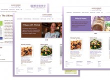
  • Brand expression: Integrate your brand look and feel into your blog using a custom theme designed specifically for your brand. You’ll look professional and readers will more easily recognize you. Just remember, your blog doesn’t and shouldn’t look exactly like your website because its purpose is different. Consider your corporate blog your website’s outgoing sister who makes friends easily.
  • Use standard blog interface design principles: Increase usability among blog readers by sticking with what they know and use:
    • Incorporate the topical tags and categories for quick sorting.
    • Include relevant links to other related sites or blogs in the sidebar.
    • Customize your CSS to choose a highly readable font and size.
    • Include your authors’ names.
    • Above all, keep it clean and easy to read.
  • Be unique and useful: That’s the goal. Your brand is about more than product details or specs. Open a dialog with actual buyers of your brand and be prepared to learn, expand and be surprised.
    TIP: Also be prepared for any negative brand feedback. You can moderate reader comments so they don’t appear right away but avoiding negative posts will look bad. It’s also likely to result in brand bashing on other non-moderated forums that you don’t control. It’s best to address criticisms openly and up front in this brave new world.
  • Become a better writer: Communicating in writing is completely different than oral presentations or interviews with a trade journal. Keep your sentence length under control and use the active voice. Additionally, be aware of non-disclosure agreements and financial regulations that guide what you can write. And if you’re uncomfortable writing, you can always have a ghostwriter express your ideas.
  • Be real: Skip the company mission statement and other corporate-speak on your blog. This is about having real conversations with real people. Authentic conversations incorporate everyone’s personalities and engage at a level not possible if you write blog entries in the same voice as your annual report. Writing in the first person helps to naturally encourage authenticity.
  • Have a plan: Most blogs close down in three months. You can ensure the longevity of your blog and readership by enacting an annual editorial plan along with allowing the spur of the moment posts. Make sure the topics planned reflect your company’s product releases, are integrated with your PR releases and have specific people assigned to handle writing and posting.
  • Think like an analyst: Set up a Google Analytics account to monitor your blog and ensure your blog template is search-engine optimized.

*Update: Mr. Schwartz is no longer CEO of Sun Microsystems.

— by Julia Moran Martz
How to Create a Winning Press Kit?

Successful press kits not only deliver timely information to editors but they also make you look and sound credible. Editors can’t risk their reputation on questionable information or sources, so make sure your message is clear and your brand represented.

To create a great press kit you must:

  1. Have something newsworthy
  2. Understand your target editors/writers
  3. Write and design your kit to those editors/writers while supporting your brand

This article focuses on writing and designing a winning kit.

Good Creative Supports Your Goal.

Great press kits go beyond photocopied releases in plain manilla envelopes. They can include digital media and be delivered electronically. They can also include samples or giveaways. Many are downright wacky and fun. But it is a fine line between enough and overkill. Highly innovative and gimmicky press kits may be the in-thing for movie launches and fashion shows, but they could fall flat without the substance to back them up or when editors are focused on widgets or financial services. Be sure your kit is designed appropriately for your niche. If your story requires bells and whistles, by all means, make some noise. Just make sure your kit doesn’t upstage your news. Pay special attention to:

  • Grammar and spelling. Poor grammar and spelling make you look careless and untrustworthy, not to mention a little dim. And for heaven’s sake, don’t rely on spell check. Remember, editors and writers care about dotting i’s and crossing t’s.
  • Kit design. Don’t undermine your brand by tossing simple press releases in a blank folder and calling it a kit. A strong brand that’s consistent within the press kit wins points with editors looking for the next great thing from a credible source.
  • File formats. Make sure your photos are high resolution. It also doesn’t hurt to include both RGB and CMYK since most publications have online components.

Creating a great kit improves your chances of becoming tomorrow’s news.

Getting Front Page Placement.


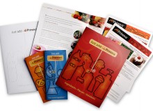
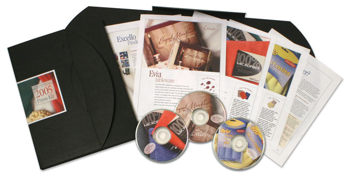
Here’s an example of a press kit that won prime placement on opening day of the annual International Housewares trade show in Chicago—exactly the right day of the year! Although this is example from a very specific niche, the same principles apply no matter what business you’re in.

Out of the thousands of new products introduced at the show, this client’s innovative and elegantly simple table cloths were included in the Chicago Tribune’s list of top 14 innovative products—with photo and above the fold—on the front page of the Home & Garden section of the Sunday edition.

How Was This Accomplished?

Nailing prime placement in key publications is never a sure thing, but it’s more likely with a combination of a great product or service, a great story and a well-done press kit.

What to Include.

Start by using product storytelling, well-written press releases and, if applicable, demonstration videos. You can also use an unusual container format to make the kit feel special. In this example, we used sleek black portfolio boxes to grab attention. It’s okay to stand out from the plain envelopes and folders gathering dust in the editor’s in-box.

Included within the kit were:

  • A press release
  • Company backgrounder
  • Product glossy (written and designed specifically for editors and writers)
  • A CD-ROM containing high-resolution photos, digital copies of the releases and a video demonstration showing how the fabric table cloths protected against spills

You can also consider including product or service fact sheets, a short list of frequently asked questions, brief and succinct testimonials and samples in your press kit. If you’re going to include any kind of glossy product info in the kit, make sure it’s targeted to the media. Do not include catalogs and sell sheets as they contain too much hyperbole and may turn off editors. Remember, keep the kit brief and valuable.

Distribution and Follow Up.

Don’t rely on a single method of distribution. This particular press kit was distributed to media giants at the Houseware’s Show Media Event in New York three months prior to the show as well as mailed to editors who did not attend. Standards today also include posting your kit’s components in the media section of your website or blog. Follow up all distributions with a phone call. No hard sell—be helpful and find out if they need or want more information.

Make sure your staff is ready for follow up and does so quickly. The Tribune requested product samples as a result of this press kit, and they were sent overnight. If your product is making specific and demonstrable claims, be prepared to have editors test the product and grill you for more information.

And smile when you’re talking with an editor or writer on the phone, they can hear that.

— by Julia Moran Martz

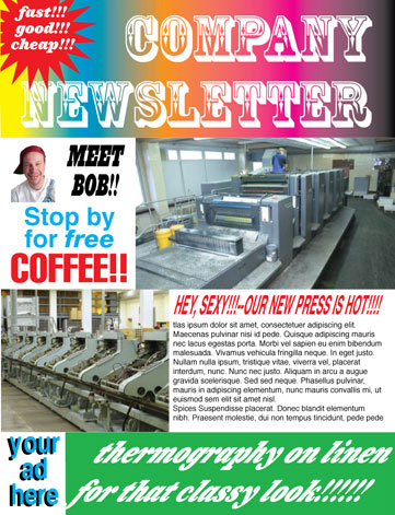
Who Cares About Newsletter Design?

You may be the best player in your region or niche, but it won’t matter to prospects and clients if you don’t appear and act credible and knowledgeable. Good newsletter content is only half of the equation. Without equally good design, your newsletter won’t instill a favorable impression, get read and ultimately help you get that foot in the door.

Design is not about using favorite colors and looking trendy. It’s actually a complex outcome of the same marketing information you use to create your key sales messages and expand your service offerings. Design deftly applies that same information to the components of your newsletter (and all your sales tools for that matter).

Keep the following in mind when planning and designing your newsletter:

  • Know your target audience and tailor your newsletter design to their needs. This includes aspects such as making sure type is legible for the age group of your list and selecting colors that are suitable for their demographic.
  • Design to support your market message without over-designing or losing yourself in a plethora of trendy design motifs. Make sure the newsletter’s design supports rather than upstages your message.
  • Look strategic by using images and copy that focus on solutions for your customers rather than your products, building or warehouse. This will position you as a company that thinks strategically and can contribute to their bigger picture and ultimately, yours.
  • Differentiate yourself from your competitors by purposefully designing to NOT look like them. Being different and distinctly recognizable allows prospects to spot you a mile away.
  • Don’t be a copycat by using the same stock images that all your competitors are using. These won’t reinforce your brand or your need to be seen in a different light than your competitors. Remember, when all things are perceived as being equal, price wins.
  • Be consistent by always using the same high-quality design for your newsletter. Consistency reinforces your prospects’ expectations of you.
  • Follow through on your design promise by acting the part. Once you have a well-designed, well-written newsletter based on a solid communications platform, you must have the ability to follow through. Make sure your sales staff is sending both verbal and written messages consistent to the quality and content of your newsletter.
  • Instill trust by consistently integrating your newsletter into your overall brand image. This will visually link the publication to your other customer touchpoints, creating cross-media recognition that reinforces your sales messages to everyone—prospects and existing clients.
  • Increase accessibility by using design to improve the reader’s experience. Articles should be easy to find and clearly differentiated from each other. Landing pages are helpful for extended articles but keep links under control. Five to seven jumps is a good number to shoot for.

Use Good Design for Every Touchpoint, Including Newsletters.

Good design gives you the power to change, reinforce and expand positive perceptions of your company. It also shows that you pay attention to detail and are able to understand the precise nuances of your customers’ needs. Customers want to know that important details won’t escape your discriminating eye when you’re part of their team. The design quality of all your sales and marketing literature creates as much of an impression as the suit you wear to that first meeting. And if done really well, good design will differentiate and position you more favorably than the next guy, giving you the edge.

What’s the bottom line?

It’s simple: Good newsletter design creates distinction between you and your competitors while consistent design keeps you visible during long sales cycles. Good design does matter.

— by Julia Moran Martz