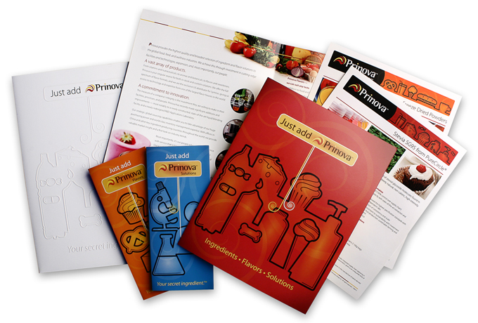
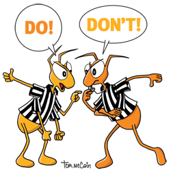
 Original and distinct communication materials with the right illustrations can help boost your product or service in a crowded marketplace. These do’s and don’ts will help you get the most return on your investment.
Do
- Obtain exclusive rights for any illustration representing your brand.
- Experiment with different types of illustrations to find out which types work best for your brand.
- Use manual illustration to add a classic charm to your materials.
- Use digital illustration to combine media, programs and techniques for very unique artwork.
- Create a licensing agreement form to expedite direct transactions with illustrators.
- Have a clear idea of what you want an illustration to convey or express.
- Work with the illustrator to create a specific set of art review and approval stages.
- Specify what individuals need to be part of the art review and approval process.
- Educate yourself about copyright ownership vs. licensing agreements. US Federal law applies copyright ownership to the artist while you are free to negotiate licensed usage agreements for the copyrighted illustration.
- Trust your artist to be the artist. If the illustration conveys your message, let the artist decide the details of the artwork.
Don’t
- Dismiss illustration because you think it’s too expensive—it’s often not.
- Treat typography as an afterthought in the overall design—awful type can ruin great artwork.
- Alter any illustration without getting the creator’s permission.
- Think that illustration is a low-tech medium of a bygone era.
- Try to illustrate materials yourself if you’re not a professional artist.
- Reject the use of a certain color just because it isn’t one of your favorites.
- Edit the life out of the illustration. Nitpicking the position of a character’s thumb or the shape of a chair corner (yes, people do it) won’t likely improve the artwork.
- Forget that hand-drawn style illustrations can be a unique way to add character to digital deliverables like video, banner ads, and websites. Just because the deliverable is digital doesn’t mean the illustration has to look like it.
- Ignore the nature of your brand personality. Illustration style, like photography, should support your brand, not fight with it.
By Larry Bauer and Tom McCain
