Think of a postcard almost like a combination of a billboard on the highway, key messages from a brochure and a call to action from your sell sheet. You’ve got barely seconds to capture your recipient and THEN, you have to give them enough of the details to beguile them. Grab their attention like a billboard but provide follow through like a brochure—that’s the trick.
Design Generalizations for Postcards.
Remember, a generalization is just that and there will always be exceptions. Here’s my list of design tips for smart postcard designers:
- All caps, bold, condensed and italic is likely not the most readable treatment for your hard-working headline. You must find a balance between a visually strong headline and one that’s easily read. Select a typeface that works, and don’t over embellish it. Do all this while staying true to your brand image.
- Images should be unique and compelling IF you have them. Keep in mind that it’s not 100% necessary to have an image with your headline; a headline could be the main visual in and of itself. But if you include an image, choose one that’s not likely to be overly used in your market, or have an image shot custom for you.
- Don’t put a strong message on a wimpy card stock. The post office’s guidelines are the minimum and are not what we recommend. The sturdier the better and not so shiny it squeaks or reflects light rather than your message. Think of this postcard as your handshake with prospects when you’re not available. Keep it firm and not too squeaky.
- Consider a straight perforation across one end for any coupon detachment if you can’t afford a fancy die to cut the shape you want. Often, a single straight perf will be a tad cheaper. You just need to design it into your card creatively.
- Skip the paragraphs of prose on your card and go for short-and-sweet messages. And keep the quantity of those to the bare minimum. Filling your card with FREE FREE FREE and loads of platitudinous drivel will make your key message and call to action hard to find quickly. All you do is end up in the trash sooner.
- Respect the reader. Despite what some advertisers in the 70’s would have us believe, customers are smart and getting smarter. They learn from each other and share information online and off. So make your message/point/deal intelligent and easy to pass on in other media.
- Don’t even think about clichés. They don’t position you as better or unique.
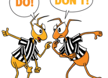
- I know Larry said in his Do’s and Don’ts list to not use type smaller than 8 point. I’m going to go one better and advise you to keep it 10 points or larger. Remember, folks are reading often at arms length in their entryway when they get home from a long day at work. Lighting in entryways is often insufficient for small text.
Postcard Anatomy 101 and Gallery.
 Front: Capture with a compelling headline and/or visual. Don’t over do it, just get them to stop and read or take the card to their desk.
Back: Follow through with the details (But not too many. This is not the place for your legal counsel to practice writing warranties.)
Prioritize your copy by what gets read first. In roughly this order, humans see visual, read headline, captions, offer and then details. So no skimping on captions and offer copy. Get it right and make it work hard for its space.

Use white space to direct the reader to what you want them to read first and second. Don’t worry about third. They may not get that far.
One Hit Wonders.
The cards below were designed as single-hit mailers, just weeks prior to a key trade show. They included pURLs (personalized URLs) on the back to provide landing pages specific to each recipient.

Cost-saving tip: pURLs were inkjet printed on the cards after they were run on a conventional offset press. You could also use variable data printing directly on a digital press and accomplish both printing and customization simultaneously. Determining which is most cost effective for your job is a balance between quality and number of inks printed.

The above tri-fold card was designed as a single-hit, pre-show mailer, just weeks prior to a key trade show. It included a teaser image to get them to open, and then followed through with booth number and incentive to visit during the show.
Three Times or More is a Charm.

You can also create a series of more than the standard three cards and schedule it to run for several months. Also don’t feel pressured into doing what everyone else does: try a different colored paper stock, try illustrations instead of photography, mix it up and be different to stand out from the crowd.
And one last thing: DO schedule overlapping smaller quantity mailings of your cards so you have time to follow up between each. You are planning on following up via phone after mailing aren’t you?
By Julia Moran Martz
 We once knew a youth soccer coach who was 10–0 in her first season and knew it was the coaching. Then she went 0–10 in her second season and knew it was the players. Consistent success depends upon bringing all the elements together. Here’s how to trounce the competition with your next postcard campaign.
 Missed Getting Your Copy of The Little Book of Marketing Do’s & Don’ts? Not to worry. We’ve made digital versions available via SlideShare. The Little Book of Marketing Do’s & Don’ts is a collection of the most viewed “Do’s & Don’ts” published by our MondoBeat newsletter including: