design

Grandiose Generalizations About Postcard Design.

Think of a postcard almost like a combination of a billboard on the highway, key messages from a brochure and a call to action from your sell sheet. You’ve got barely seconds to capture your recipient and THEN, you have to give them enough of the details to beguile them. Grab their attention like a billboard but provide follow through like a brochure—that’s the trick.

Design Generalizations for Postcards.

Remember, a generalization is just that and there will always be exceptions. Here’s my list of design tips for smart postcard designers:

  • All caps, bold, condensed and italic is likely not the most readable treatment for your hard-working headline. You must find a balance between a visually strong headline and one that’s easily read. Select a typeface that works, and don’t over embellish it. Do all this while staying true to your brand image.
  • Images should be unique and compelling IF you have them. Keep in mind that it’s not 100% necessary to have an image with your headline; a headline could be the main visual in and of itself. But if you include an image, choose one that’s not likely to be overly used in your market, or have an image shot custom for you.
  • Don’t put a strong message on a wimpy card stock. The post office’s guidelines are the minimum and are not what we recommend. The sturdier the better and not so shiny it squeaks or reflects light rather than your message. Think of this postcard as your handshake with prospects when you’re not available. Keep it firm and not too squeaky.
  • Consider a straight perforation across one end for any coupon detachment if you can’t afford a fancy die to cut the shape you want. Often, a single straight perf will be a tad cheaper. You just need to design it into your card creatively.
  • Skip the paragraphs of prose on your card and go for short-and-sweet messages. And keep the quantity of those to the bare minimum. Filling your card with FREE FREE FREE and loads of platitudinous drivel will make your key message and call to action hard to find quickly. All you do is end up in the trash sooner.
  • Respect the reader. Despite what some advertisers in the 70’s would have us believe, customers are smart and getting smarter. They learn from each other and share information online and off. So make your message/point/deal intelligent and easy to pass on in other media.
  • Don’t even think about clichés. They don’t position you as better or unique.
  • I know Larry said in his Do’s and Don’ts list to not use type smaller than 8 point. I’m going to go one better and advise you to keep it 10 points or larger. Remember, folks are reading often at arms length in their entryway when they get home from a long day at work. Lighting in entryways is often insufficient for small text.

Postcard Anatomy 101 and Gallery.
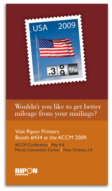
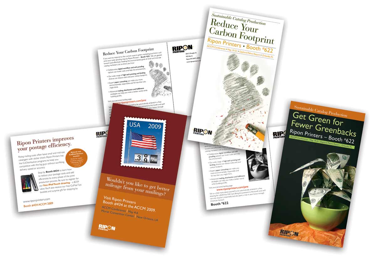
Ripon Postcard FrontFront: Capture with a compelling headline and/or visual. Don’t over do it, just get them to stop and read or take the card to their desk.

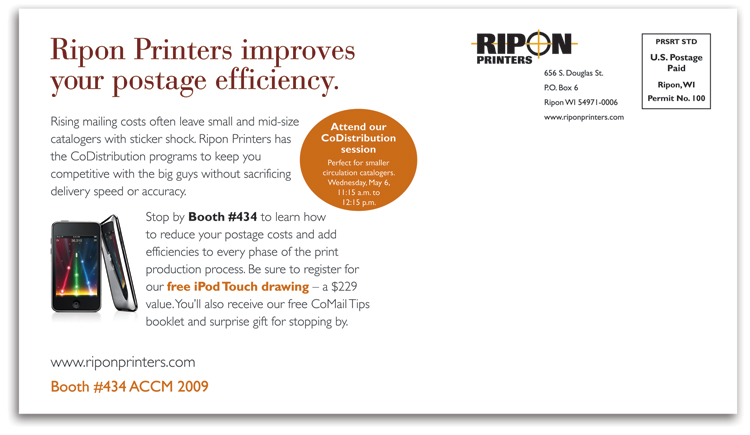
Back: Follow through with the details (But not too many. This is not the place for your legal counsel to practice writing warranties.)

Prioritize your copy by what gets read first. In roughly this order, humans see visual, read headline, captions, offer and then details. So no skimping on captions and offer copy. Get it right and make it work hard for its space.

Ripon Postcard Back

Use white space to direct the reader to what you want them to read first and second. Don’t worry about third. They may not get that far.


One Hit Wonders.

The cards below were designed as single-hit mailers, just weeks prior to a key trade show. They included pURLs (personalized URLs) on the back to provide landing pages specific to each recipient.

Ripon Printers Postcard Singles

Cost-saving tip: pURLs were inkjet printed on the cards after they were run on a conventional offset press. You could also use variable data printing directly on a digital press and accomplish both printing and customization simultaneously. Determining which is most cost effective for your job is a balance between quality and number of inks printed.

Stromberg Allen tri-fold postcard

The above tri-fold card was designed as a single-hit, pre-show mailer, just weeks prior to a key trade show. It included a teaser image to get them to open, and then followed through with booth number and incentive to visit during the show.

Three Times or More is a Charm.

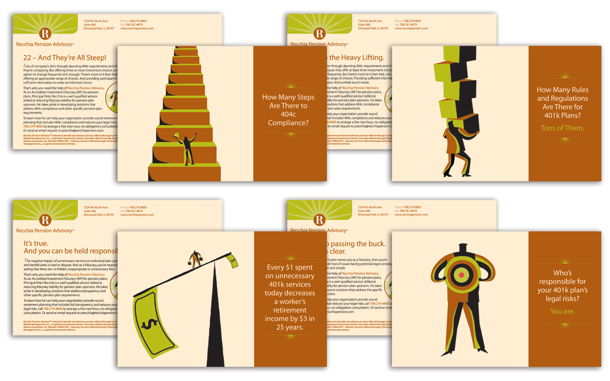
Recchia Postcard Campaign

You can also create a series of more than the standard three cards and schedule it to run for several months. Also don’t feel pressured into doing what everyone else does: try a different colored paper stock, try illustrations instead of photography, mix it up and be different to stand out from the crowd.

And one last thing: DO schedule overlapping smaller quantity mailings of your cards so you have time to follow up between each. You are planning on following up via phone after mailing aren’t you?

By Julia Moran Martz
Design tips for enhanced comprehension.

Note: Our ongoing series of design tips will assist you in creating marketing collateral by improving comprehension, speed of reading and increase belief in your value whether you’re selling products or services to consumers or businesses.

Using good design to ensure you look professional is akin to using darts and tucks on a suit jacket for a good fit around your content. You wouldn’t show up to an important meeting with rags hanging from your shoulders. Likewise, make sure any materials that represent you are also an extension of that same level of quality.

Tip 1: Using single word spaces between sentences.

In the words of Robert Bringhurst, The Elements of Typographic Style, 1992:

In the nineteenth century, which was a dark and inflationary age in typography and type design, many compositors were encouraged to stuff extra space between sentences. Generations of twentieth-century typists were then taught to do the same, by hitting the spacebar twice after every period. Your typing as well as your typesetting will benefit from unlearning this quaint Victorian habit. As a general rule, no more than a single space is required after a period, a colon or any other mark of punctuation. Larger spaces (e.g., en spaces) are themselves punctuation.”

“The rule is usually altered, however, when setting classical Latin or Greek, romanized Sankrit, phonetics or other kinds of text in which sentences begin with lowercase letters. In the absence of a capital, a full en space (M/2) between sentences will generally be welcome.”


“White” Paper Doesn’t Mean Generic.

cainyCastor-250Creating a successful white paper isn’t just about the content. The content is in fact worthless if:

  • The paper doesn’t support the brand,
  • It’s too hard to read,
  • Your credibility is lacking because the paper looks amateurish, and
  • Your charts or graphics are boring.

I dare say most white papers are not tackling new theories or topics. And in a highly competitive situation, who are your prospects going to believe? The guy in the rumpled suit or the guy whose shirt is pressed, shoes polished and handshake firm? Likewise, a rumpled and amateurish white paper will not engender trust.

Here are five design guidelines for creating highly functioning and trustworthy white papers:

  1. Keep it readable:Readability is created by a combination of design tactics that take your specific content and audience into account.Choice of typeface is top on the list. While all computers have Arial available, a smarter choice for readability of long passages would be a face with a larger x-height. For example, for readability of lengthy white papers on screen, Verdana or Georgia are two excellent options. For readability on paper, Myriad Pro or Garamond may work well. Serif typefaces are usually more readable than sans serif, but you also have to weight that difference with your brand’s needs. Of course, there are thousands of typefaces available and your corporate brand style guide may also govern the ones you use.Bigger is not always better when it comes to sizing type. That said, there are many designers who adhere to the school of tiny type. Use a designer who understands the nuances of type size as it relates to your content, writing style, typeface selection and most importantly, the needs or your target demographic. Striking the right balance in size means ensuring readers can easily read your paper without squinting and that your type isn’t so large that they can’t see the forest for the trees.

    Also consider line length and line spacing. Line lengths that are too short cause too much hyphenation and make reading a choppy venture. Lines that are too long make it difficult for the mind’s eye to track from the end of one line to the beginning of the next. To optimize reading speed, designers have for years been using the 66-72 characters per line rule. Generally speaking, this rule continues to work very well but again, is dependent on your white paper’s specific needs. Papers with lots of very long words may require a slightly longer line length. Just try reading a James Joyce novel with a short line length—painfully slow.

    Line spacing also affects the ability of the mind’s eye to read quickly. Spacing that is too much or too little will slow the reader down, getting your message embedded later rather than sooner. Line spacing is also interdependent on typeface selection and average word length.

    Keeping your white paper readable at maximum warp speed is a fine balance between many factors.

  2. Look professional: Good design will pre-sell your white paper and ultimately, you.Not realizing this and acting on it will place you in the league of second bests or the do-not-consider group. It’s really not any different than showing up at an interview in a freshly pressed suit, shoes polished, hair in place, teeth clean and nails trimmed.Likewise, if your white paper looks like it was created in Microsoft Word, it will compete poorly against a competitor’s paper that is branded, polished, neat and professional. There are many design nuances that Microsoft Word or Publisher lack but a good designer trained in traditional typographic techniques can provide.
  3. Be interesting: Being lively and interesting will get you more attention than the party bore.Don’t think that the term ‘white paper’ means you can’t use color or interesting graphics. White paper doesn’t refer to the overall design of your paper, and you’re doing your brand and your customer or prospect a disservice by not making your paper visually interesting.Now I don’t mean embellish your paper with fancy dingbats and doodads that don’t add value. Good design is not about decoration. Make sure all your graphics are working hard for the content and/or the brand image. And do something to stand out. Don’t be boring.
  4. Design for the distribution method:Good white papers will be shared digitally among peers.If your white paper is being distributed via email, be careful to adhere to the email marketing laws in the country of distribution, don’t use spam triggers, do apply permission-based marketing techniques and make it easy to share by including forward links.If your paper is a downloadable PDF, recipients are more likely to print it before reading. So make sure you design it to be most readable printed from an inkjet printer.

    If you are professionally printing your paper for snail-mail distribution, you must also consider the paper stock used and ideally, make sure it is ballpoint or pencil ready with healthy margins for jotting notes.

  5. Pay attention to details: If God and the devil are both in the details, then this is where you’d better spend some time.We all know of HR people who throw away any resumes with typos, punctuation and grammar errors. It’s one way to narrow the field to the real professionals. Ditto with thought leadership and design. If you don’t look buttoned up in terms of details, how will prospects trust you with the details of their business?

In terms of white paper design details, look out for these common mistakes:

  • Ditch those double spaces between sentences. It affects reading speed and isn’t necessary since we no longer use typewriters.
  • Be consistent with periods and commas. If you’re using a serial comma, stick with it.
  • Don’t break proper nouns at the end of a line, especially if the line length is long.
  • Watch for too many hyphenations, which also slow reading and just look like you don’t care.
  • Keep your bullets closer to their text than the line below them.
  • Use a grid to align your content perfectly so nothing looks out of place.
  • Consider balance of elements on a page. Look for triangulation of weight.
  • Use styles to keep content consistently formatted.
  • Use color appropriately and don’t overuse. This isn’t a flea market.
  • Consider how your document will be printed and if on an office inkjet, make sure key content doesn’t exceed printer margins.
  • Align table columns appropriately for the content. Align decimals on the decimal, for instance.

Skimpy Investments Deliver Skimpy Results.

Ultimately, good white paper design is about taking care of your prospects, making it easy for them to consider you. Yes, it’s a larger investment, but if that’s what gets you moved to the head of the pack, then that’s what you must do.

Remember, looking the part and being easy to understand shortens the distance to being considered a thought leader.

By Julia Moran Martz