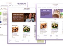
You may be the best player in your region or niche, but it won’t matter to prospects and clients if you don’t appear and act credible and knowledgeable. Good newsletter content is only half of the equation. Without equally good design, your newsletter won’t instill a favorable impression, get read and ultimately help you get that foot in the door.
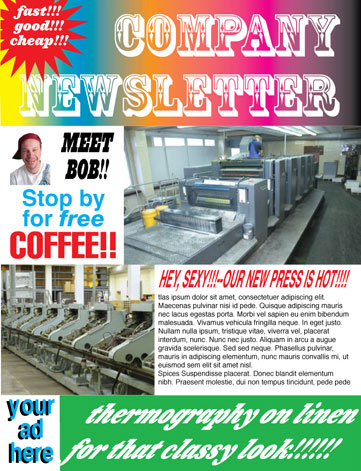 Design is not about using favorite colors and looking trendy. It’s actually a complex outcome of the same marketing information you use to create your key sales messages and expand your service offerings. Design deftly applies that same information to the components of your newsletter (and all your sales tools for that matter).
Keep the following in mind when planning and designing your newsletter:
- Know your target audience and tailor your newsletter design to their needs. This includes aspects such as making sure type is legible for the age group of your list and selecting colors that are suitable for their demographic.
- Design to support your market message without over-designing or losing yourself in a plethora of trendy design motifs. Make sure the newsletter’s design supports rather than upstages your message.
- Look strategic by using images and copy that focus on solutions for your customers rather than your products, building or warehouse. This will position you as a company that thinks strategically and can contribute to their bigger picture and ultimately, yours.
- Differentiate yourself from your competitors by purposefully designing to NOT look like them. Being different and distinctly recognizable allows prospects to spot you a mile away.
- Don’t be a copycat by using the same stock images that all your competitors are using. These won’t reinforce your brand or your need to be seen in a different light than your competitors. Remember, when all things are perceived as being equal, price wins.
- Be consistent by always using the same high-quality design for your newsletter. Consistency reinforces your prospects’ expectations of you.
- Follow through on your design promise by acting the part. Once you have a well-designed, well-written newsletter based on a solid communications platform, you must have the ability to follow through. Make sure your sales staff is sending both verbal and written messages consistent to the quality and content of your newsletter.
- Instill trust by consistently integrating your newsletter into your overall brand image. This will visually link the publication to your other customer touchpoints, creating cross-media recognition that reinforces your sales messages to everyone—prospects and existing clients.
- Increase accessibility by using design to improve the reader’s experience. Articles should be easy to find and clearly differentiated from each other. Landing pages are helpful for extended articles but keep links under control. Five to seven jumps is a good number to shoot for.
Use Good Design for Every Touchpoint, Including Newsletters.
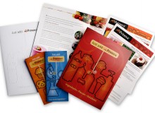
Good design gives you the power to change, reinforce and expand positive perceptions of your company. It also shows that you pay attention to detail and are able to understand the precise nuances of your customers’ needs. Customers want to know that important details won’t escape your discriminating eye when you’re part of their team. The design quality of all your sales and marketing literature creates as much of an impression as the suit you wear to that first meeting. And if done really well, good design will differentiate and position you more favorably than the next guy, giving you the edge.
What’s the bottom line?
It’s simple: Good newsletter design creates distinction between you and your competitors while consistent design keeps you visible during long sales cycles. Good design does matter.
— by Julia Moran Martz

