About Julia Moran Martz

http://www.mondovox.com

Julia Moran Martz is Partner and Co-Creative Director of MondoVox, Inc. and has 29 years experience in communications and design solutions for consumer products, life science, technology and consulting companies, as well as management and business development experience in technology and dotcom sectors.

Posts by Julia Moran Martz:

Creating Clutter Busting Dimensional Direct Mail.

I know it sometimes seems that you have to do something REALLY BIG to break through the mailroom clutter. But honestly, size doesn’t matter. You don’t need to build a Taj Mahal for your prospects. Even those C-level folks.

What you MUST do is make sure your mailing’s message supports your goals and is relevant to your target market. And above all, match the quality of your 3D object to your brand.

For example, if your key marketing message is about protecting your clients, don’t mail something like the cheapest umbrella that’s going to break after the third or fifth use. That will reflect poorly on your key brand message. Likewise, don’t overshoot your brand. Sending out gold-plated key fobs could be perceived as bribery if your brand is all about affordable office supplies, for instance.

The best way to start is with your creative brief: define your goals and targets, and THEN your message will naturally follow. Assuming you’ve written your creative brief, here are some examples of 3D mailing types to get your creative juices flowing.

3D Campaign Types.

I categorize 3D mailings into three types:

1. The fun gadget:

Stromberg Allen direct mail series: Even though Stromberg Allen gained approved vendor status with several new clients, they still needed to snag the attention of the clients’ internal buyers. As a printer of K-12 learning tools, they have the capability to produce very complex dimensional products using many components, and they wanted to demonstrate this expertise. We created a campaign of four boxed items that displayed their ability to produce fun, yet educational tools by marrying a gadget with a marketing message and booklets inside the boxes. The sales team then received instructions to send these to their specific targets one week apart until they snagged a meeting. Without sales’ cooperation and follow through, an expensive campaign like this would be wasted. Be sure to train your entire team before implementation of any campaign.

Benefit Downside
Fun to receive; if done right, can be memorable AND get your message across. May end up with kid at home if it’s TOO fun, which defeats your purpose of having it stick around as a reminder on the recipient’s desk.

2. The helpful tool:

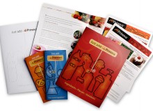
Ripon Printers printing tools series: Ripon Printers’ capabilities include practically anything you’d want in a printer: digital/offset/web, cold and heatset, fulfillment, custom ink jetting, list hygiene and maintenance, catalog/education/direct marketing expertise, and web-storefront capabilities. To spread the word of their wide range of expertise, MondoVox concepted and designed a series of handy Tips Books (one per service area) and a video that would serve multiple marketing tasks. Not only do sales representatives distribute these tools to their existing customers, MondoVox also created a multipart direct mail campaign targeting new prospects. We created a handy book box for the tips books and a disc mailer for the video DVD. Ripon uses these 3D mailings along with a personalized introductory brochure to complete a three-part campaign for all new prospect lists.

This is a great example of how you can be 3D even if using relatively flat objects like books or DVDs. No need to throw in a pen just to get a bump on your envelope. It’s also a good example of a series within a series; the tips books can be mailed individually with the first one going out with the book box and the others arriving one week apart until the recipient fills the box.

Benefit Downside
If it’s truly a great tool, it will have a high sticky factor. In fact, don’t be surprised if prospects take your tools from job to job if they find them particularly valuable. Can come off as matter-of-fact and serious rather than providing any sort of clever gotcha moment. BUT if concepted carefully, a tool series can accomplish both.

3. Custom product samples:

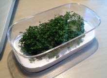
Gourmetceuticals Taste Test Kit: Being new to the market, Gourmetceuticals needed to quickly convince food ingredient buyers that their nutritional ingredients did not impart negative flavors in final products but did offer all the benefits of nutritional supplements. We created a Taste-Test Kit using a granola product developed by a partnership between Nuts Are Good and Gourmetceuticals. The granola packs were designed to resemble grocery-ready food items while containing technical information directed to the buyer. Accompanying the samples was a cover letter and instructional booklet that walked the buyer through tasting the product, ultimately convincing them that Gourmetceuticals’ ingredients provide added nutrition while not imparting negative flavors or aftertastes. Careful pre-qualification of a limited number of targets allowed us to mail the kits via a parcel delivery service.

These kits were so successful that we expanded to include a print ad + landing page kit request to attract additional buyers.

Benefit Downside
By carefully controlling the message with a custom product sample, you have the opportunity to demonstrate your product AND get the meeting. Seemingly the most boring of all options, BUT could actually be quite effective if matched with a catchy message and the right target market. Also more labor intensive than just ordering a box of pens, but the potential payoff is much greater.

Don’t Be a Joke-in-a-Box.

While everyone wants to do the fun, gadget-type of campaign, that’s not always the most appropriate or most effective 3D object to incorporate. Consider carefully your brand reputation and key marketing messages to determine what type is best for you.

By Julia Moran Martz

The Art of the Envelope Tease.

One of the biggest mistakes designers can make is ignoring the envelope that contains their client’s direct mail components. Envelopes are the key tool that determines whether your direct mail gets opened or gets ditched.

Design Tips for Creating Intriguing Envelopes for Your Direct Mail Campaign.

  • Vary the size: think outside of the standard #10 envelope. Look at oversized envelopes or even undersized. Anything to break out of the normal in-box clutter.
  • Use color: consider envelopes that reflect your brand’s primary color or consider anything that isn’t white, yet fits your offer. White envelopes tend to blend in with everything else in the recipient’s mailbox. Consult your designer or printer for interesting textures and colors.
  • Print a teaser message on the envelope: the operative word here is ‘teaser.’ There’s no rule that says you need to give it all away up front. Leave a little something to reward them for opening. Keep the message enticing.
  • Consider using a translucent or clear envelope: if your budget allows, there are a myriad of clear and translucent options. Choices include vellum, glassine and polybag-type envelopes. But be cautious when sourcing vellum as not all are crack resistant. Consult with your printer for vellum options that minimize cracking. And also don’t assume that polybag-type envelopes are only available in crystal clear. There are many exciting color choices that ignite the imagination. ClearBags has a great online resource to get your creative juices flowing, but do work you’re your printer for larger quantities.
  • Consider the design of the interior components up front. Don’t’ just toss them in a clear envelope without thought to what will show through. Again, you may need to redesign the outward facing messages on the interior components if you’re using a clear envelope.
  • You may also consider window envelopes as an alternative to solid paper or clear poly envelopes. There are several sizes including booklet envelopes with nearly full-view windows that deliver a similar effect.

Production Considerations.

  • If going with a translucent or clear envelope, you’ll have to reconsider how you handle addressing the envelope. Depending on the color and translucency of the material, you may have to use an address label. Or you could design the backside of the inserts to contain the address info.
  • Remember what I said about vellum. While insanely cool, you must work with a good printer to spec a stock that is crack resistant.
  • Some envelopes don’t come with a sticky seal. Some glassine envelopes, for instance, may require you to use a label to close the flap. This is another opportunity for messaging.
  • While an envelope mailer will cost more to produce than a postcard, a well-designed envelope can outperform a postcard if the message is right for a closed-envelope package. The challenges are the budget, of course, and ensuring the envelope is the right vehicle for your direct mail’s desired outcome.
  • Spec converted envelopes to save money. The only drawback is that you won’t be able to print across folds or bleed off a cut edge. But a good designer can certainly work within these restrictions to save you money.

Ignore at your own peril the envelope’s ability to tease, entice, intrigue and seduce the recipient. But also remember what mom advised in your youth: don’t give it all away up front and do leave something to the imagination. Envelopes are no different. Enticing someone to open is often a matter of making a promise but only enough to generate excitement. Like wearing just the right dress on your first date. Not too much, not too little.

By Julia Moran Martz

Grandiose Generalizations About Postcard Design.

Think of a postcard almost like a combination of a billboard on the highway, key messages from a brochure and a call to action from your sell sheet. You’ve got barely seconds to capture your recipient and THEN, you have to give them enough of the details to beguile them. Grab their attention like a billboard but provide follow through like a brochure—that’s the trick.

Design Generalizations for Postcards.

Remember, a generalization is just that and there will always be exceptions. Here’s my list of design tips for smart postcard designers:

  • All caps, bold, condensed and italic is likely not the most readable treatment for your hard-working headline. You must find a balance between a visually strong headline and one that’s easily read. Select a typeface that works, and don’t over embellish it. Do all this while staying true to your brand image.
  • Images should be unique and compelling IF you have them. Keep in mind that it’s not 100% necessary to have an image with your headline; a headline could be the main visual in and of itself. But if you include an image, choose one that’s not likely to be overly used in your market, or have an image shot custom for you.
  • Don’t put a strong message on a wimpy card stock. The post office’s guidelines are the minimum and are not what we recommend. The sturdier the better and not so shiny it squeaks or reflects light rather than your message. Think of this postcard as your handshake with prospects when you’re not available. Keep it firm and not too squeaky.
  • Consider a straight perforation across one end for any coupon detachment if you can’t afford a fancy die to cut the shape you want. Often, a single straight perf will be a tad cheaper. You just need to design it into your card creatively.
  • Skip the paragraphs of prose on your card and go for short-and-sweet messages. And keep the quantity of those to the bare minimum. Filling your card with FREE FREE FREE and loads of platitudinous drivel will make your key message and call to action hard to find quickly. All you do is end up in the trash sooner.
  • Respect the reader. Despite what some advertisers in the 70’s would have us believe, customers are smart and getting smarter. They learn from each other and share information online and off. So make your message/point/deal intelligent and easy to pass on in other media.
  • Don’t even think about clichés. They don’t position you as better or unique.
  • I know Larry said in his Do’s and Don’ts list to not use type smaller than 8 point. I’m going to go one better and advise you to keep it 10 points or larger. Remember, folks are reading often at arms length in their entryway when they get home from a long day at work. Lighting in entryways is often insufficient for small text.

Postcard Anatomy 101 and Gallery.

Ripon Postcard FrontFront: Capture with a compelling headline and/or visual. Don’t over do it, just get them to stop and read or take the card to their desk.

Back: Follow through with the details (But not too many. This is not the place for your legal counsel to practice writing warranties.)

Prioritize your copy by what gets read first. In roughly this order, humans see visual, read headline, captions, offer and then details. So no skimping on captions and offer copy. Get it right and make it work hard for its space.

Ripon Postcard Back

Use white space to direct the reader to what you want them to read first and second. Don’t worry about third. They may not get that far.


One Hit Wonders.

The cards below were designed as single-hit mailers, just weeks prior to a key trade show. They included pURLs (personalized URLs) on the back to provide landing pages specific to each recipient.

Ripon Printers Postcard Singles

Cost-saving tip: pURLs were inkjet printed on the cards after they were run on a conventional offset press. You could also use variable data printing directly on a digital press and accomplish both printing and customization simultaneously. Determining which is most cost effective for your job is a balance between quality and number of inks printed.

Stromberg Allen tri-fold postcard

The above tri-fold card was designed as a single-hit, pre-show mailer, just weeks prior to a key trade show. It included a teaser image to get them to open, and then followed through with booth number and incentive to visit during the show.

Three Times or More is a Charm.

Recchia Postcard Campaign

You can also create a series of more than the standard three cards and schedule it to run for several months. Also don’t feel pressured into doing what everyone else does: try a different colored paper stock, try illustrations instead of photography, mix it up and be different to stand out from the crowd.

And one last thing: DO schedule overlapping smaller quantity mailings of your cards so you have time to follow up between each. You are planning on following up via phone after mailing aren’t you?

By Julia Moran Martz