About Julia Moran Martz

http://www.mondovox.com

Julia Moran Martz is Partner and Co-Creative Director of MondoVox, Inc. and has 29 years experience in communications and design solutions for consumer products, life science, technology and consulting companies, as well as management and business development experience in technology and dotcom sectors.

Posts by Julia Moran Martz:

Extending Your Brand To and Beyond the Webinar.

Assuming your presentation is buttoned-up tight and focused cleanly on your topic, what else can you do to ensure wise use of your webinar budget? Well, it’s all about two key points we seem to repeat a lot:

  1. Ensuring brand integrity builds and maintains brand recognition.
  2. Linking this particular tool (webinars) with other marketing and sales tools builds a network around your prospects, creating additional sales touch points.

Essentially, it’s all about maintaining professionalism while being available where and when your prospects need you.

Ensuring Brand Integrity In Webinars.

This seems pretty limited on the surface, right? It would appear that all you can do is send the webinar company your logo as a low-res jpeg and hope for the best. While that may be true with some third-party webinar companies, consider these options below and push, push, push on behalf of your brand.

  • Make sure your presentation is easy to read for the age group of the attendees and includes key brand elements such as logo, colors, fonts (where possible), image assets, etc. This is especially important because the webinar company will be using their own brand elements in the general interface.
  • Don’t choose an outsourced webinar delivery platform based solely on price. Also DO consider how well its interface supports branding your webinar as well as its user-friendliness.
  • Realize that folks will be attending from a variety of platforms and monitor sizes. Adjust the content of your graphics and text appropriately. If your Corporate Brand Guidebook doesn’t contain information specific to webinars, pull from the chapters for PowerPoint and Website styling.
  • Choose a speaker whose voice is appropriate for your brand. If your subject matter expert has a whiney voice, choose someone else or outsource. Stay away from extremely high or low-pitched voices, as they may be hard to hear and understand via many computer audio systems. If you’re selling cosmetics, consider using a female voice. Whereas sports or auto related topics may be able to go either way depending on the audience.
  • Be certain that your support materials are brand cohesive. This includes anything you’re linking to from the webinar such as white papers, case studies, speaker bios or an annotated outline of the webinar content.
  • If you’re sponsoring a trade pub’s webinar, ensure that you’re using every brand tool at your disposal: logo files, ad page, banner ad and link to landing page for more info. Negotiate for additional touch points where possible and connect them back to tools you can control such as landing pages or your website.

Opportunities for Extending Your Brand Beyond the Webinar.

Working your communications before and after the webinar takes research, planning and time. But the key benefit is keeping your audience engaged beyond the webcast to the point of closing a sale.

Imagine being a big-ticket sales person in a brick and mortar store and discovering a way to get the name, phone number and email address of every interested shopper with whom you spoke? You’d do it, right? Even if they didn’t buy from you right away, you could provide additional information and follow up with them during and after their buying process.

This is why it’s critical to look for opportunities to increase the viral aspect of your brand beyond the basic webinar.

  • Make sure you create avenues for attendees to interact with you following the event. Creating an ongoing forum or listserv or even linking to a blog post about your topic provides additional discussion options. If you already have an online discussion forum, open a new topic coinciding with the webinar and publicize it in follow-up communications.
  • Also ensure that your speakers have valid corporate Twitter and/or LinkedIn accounts for attendees to connect with afterwards, and provide that information freely at the webinar. Both tools have methods of supporting discussion topics.
  • Consider setting up a landing page or mini-site to support your webinar. Use this as an info link during registration and reminders, and then modify it afterwards to collect more information during post webinar follow up.
  • Consider timing your webinar close to a key industry trade show and include special invitations to webinar attendees for a VIP session or special gift at the show. This takes advantage of your sales team’s limited travel budgets.
  • If you’re offering in-depth workshops at an upcoming trade show, pre-empt the show with a preparatory session via a webinar. This can generate excitement for the show and increase valid attendees at the live event.
  • And remember, if you’re creating your own webinar content, you can still advertise it via banner ads in industry publications, usually for relatively modest expenditures.

Ultimately, It’s About Building Branded Networks.

Don’t think of a webinar as a one-off event. Use it as a building block within your entire communications network to get the biggest impact.

“White” Paper Doesn’t Mean Generic.

cainyCastor-250Creating a successful white paper isn’t just about the content. The content is in fact worthless if:

  • The paper doesn’t support the brand,
  • It’s too hard to read,
  • Your credibility is lacking because the paper looks amateurish, and
  • Your charts or graphics are boring.

I dare say most white papers are not tackling new theories or topics. And in a highly competitive situation, who are your prospects going to believe? The guy in the rumpled suit or the guy whose shirt is pressed, shoes polished and handshake firm? Likewise, a rumpled and amateurish white paper will not engender trust.

Here are five design guidelines for creating highly functioning and trustworthy white papers:

  1. Keep it readable:Readability is created by a combination of design tactics that take your specific content and audience into account.Choice of typeface is top on the list. While all computers have Arial available, a smarter choice for readability of long passages would be a face with a larger x-height. For example, for readability of lengthy white papers on screen, Verdana or Georgia are two excellent options. For readability on paper, Myriad Pro or Garamond may work well. Serif typefaces are usually more readable than sans serif, but you also have to weight that difference with your brand’s needs. Of course, there are thousands of typefaces available and your corporate brand style guide may also govern the ones you use.Bigger is not always better when it comes to sizing type. That said, there are many designers who adhere to the school of tiny type. Use a designer who understands the nuances of type size as it relates to your content, writing style, typeface selection and most importantly, the needs or your target demographic. Striking the right balance in size means ensuring readers can easily read your paper without squinting and that your type isn’t so large that they can’t see the forest for the trees.

    Also consider line length and line spacing. Line lengths that are too short cause too much hyphenation and make reading a choppy venture. Lines that are too long make it difficult for the mind’s eye to track from the end of one line to the beginning of the next. To optimize reading speed, designers have for years been using the 66-72 characters per line rule. Generally speaking, this rule continues to work very well but again, is dependent on your white paper’s specific needs. Papers with lots of very long words may require a slightly longer line length. Just try reading a James Joyce novel with a short line length—painfully slow.

    Line spacing also affects the ability of the mind’s eye to read quickly. Spacing that is too much or too little will slow the reader down, getting your message embedded later rather than sooner. Line spacing is also interdependent on typeface selection and average word length.

    Keeping your white paper readable at maximum warp speed is a fine balance between many factors.

  2. Look professional: Good design will pre-sell your white paper and ultimately, you.Not realizing this and acting on it will place you in the league of second bests or the do-not-consider group. It’s really not any different than showing up at an interview in a freshly pressed suit, shoes polished, hair in place, teeth clean and nails trimmed.Likewise, if your white paper looks like it was created in Microsoft Word, it will compete poorly against a competitor’s paper that is branded, polished, neat and professional. There are many design nuances that Microsoft Word or Publisher lack but a good designer trained in traditional typographic techniques can provide.
  3. Be interesting: Being lively and interesting will get you more attention than the party bore.Don’t think that the term ‘white paper’ means you can’t use color or interesting graphics. White paper doesn’t refer to the overall design of your paper, and you’re doing your brand and your customer or prospect a disservice by not making your paper visually interesting.Now I don’t mean embellish your paper with fancy dingbats and doodads that don’t add value. Good design is not about decoration. Make sure all your graphics are working hard for the content and/or the brand image. And do something to stand out. Don’t be boring.
  4. Design for the distribution method:Good white papers will be shared digitally among peers.If your white paper is being distributed via email, be careful to adhere to the email marketing laws in the country of distribution, don’t use spam triggers, do apply permission-based marketing techniques and make it easy to share by including forward links.If your paper is a downloadable PDF, recipients are more likely to print it before reading. So make sure you design it to be most readable printed from an inkjet printer.

    If you are professionally printing your paper for snail-mail distribution, you must also consider the paper stock used and ideally, make sure it is ballpoint or pencil ready with healthy margins for jotting notes.

  5. Pay attention to details: If God and the devil are both in the details, then this is where you’d better spend some time.We all know of HR people who throw away any resumes with typos, punctuation and grammar errors. It’s one way to narrow the field to the real professionals. Ditto with thought leadership and design. If you don’t look buttoned up in terms of details, how will prospects trust you with the details of their business?

In terms of white paper design details, look out for these common mistakes:

  • Ditch those double spaces between sentences. It affects reading speed and isn’t necessary since we no longer use typewriters.
  • Be consistent with periods and commas. If you’re using a serial comma, stick with it.
  • Don’t break proper nouns at the end of a line, especially if the line length is long.
  • Watch for too many hyphenations, which also slow reading and just look like you don’t care.
  • Keep your bullets closer to their text than the line below them.
  • Use a grid to align your content perfectly so nothing looks out of place.
  • Consider balance of elements on a page. Look for triangulation of weight.
  • Use styles to keep content consistently formatted.
  • Use color appropriately and don’t overuse. This isn’t a flea market.
  • Consider how your document will be printed and if on an office inkjet, make sure key content doesn’t exceed printer margins.
  • Align table columns appropriately for the content. Align decimals on the decimal, for instance.

Skimpy Investments Deliver Skimpy Results.

Ultimately, good white paper design is about taking care of your prospects, making it easy for them to consider you. Yes, it’s a larger investment, but if that’s what gets you moved to the head of the pack, then that’s what you must do.

Remember, looking the part and being easy to understand shortens the distance to being considered a thought leader.

By Julia Moran Martz

Boosting Your Brand With Thought Leadership.

suM-250Being a thought leader in your industry is critical to supporting and expanding your brand. The strongest brands are those owned and managed by thought leaders. That’s because thought leaders understand that there are key building blocks enabling their position.
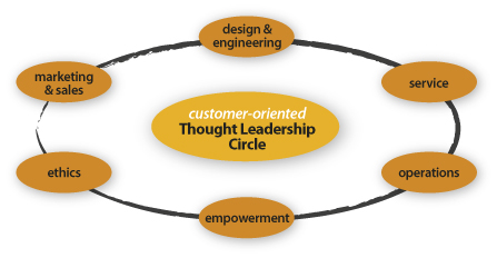

Thought leadership building blocks:

  • Design & engineering (product/service, process, store, graphics, interactive)
  • Marketing & sales (multichannel media, sales methodology)
  • Service (phone, online, social media, mail, in-person)
  • Operations (raw materials, manufacturing, warehousing, delivery)
  • Ethics (your brand’s moral compass including aspects such as fair trade, labor practices, environmental responsibility and community support)
  • Empowerment (employees, vendors, partners, customers)

thought-leadership-circle-LG

The strength of the Thought Leadership Circle is only as good as its weakest link.

A solid network of thought leadership building blocks enables trust in the reputation of your brand. Imagine a perfect circle made of building blocks surrounding your customers. As the thought leader in your category, you must continually excel at all of the above to prove your leadership worthiness. Any misstep impacts your position and ultimately, your brand’s integrity.

In this article, we’ll review the design component of thought leadership.

Using Design As A Thought Leadership Building Block.

Looking the part of the thought leader ensures your customer pays even closer attention to what you say and do. For example, let’s look at IKEA, arguably THE thought leader in the modernist home furnishing market.

IKEA spent the past 50 years building its reputation as THE expert in affordable modern design for the home. Going way beyond just designing modern products, IKEA modernized the process of buying home products and designed stores that include everything for the home. They managed to instill a global and modern design sense in every aspect of their business, thus building the ultimate modern brand. IKEA is the thought leader of modernist home furnishings. It is the go-to expert if you want affordable, cool, modern stuff for your crib with that special IKEA shopping experience.

But, and you knew there was a ‘but,’ right?

Very recently, IKEA enlisted in a rebranding project and as a result, changed its corporate typefaces from their customized versions of Futura and Century Schoolbook (a.k.a. IKEA Sans and IKEA Serif) to Verdana. The objective was to unify the company’s online and print typefaces to save costs on global implementation. While a respectable goal, this brand maneuver is resulting in a huge outpouring of criticism in the blogosphere, Twitterverse, newsfeeds and online forums, ultimately questioning their future position as thought leader for modern home furnishings.

Why Is This Even an Issue?

On the surface, this may not seem like a big deal. But what IKEA failed to take into consideration is that the typography component of design is a method by which we express the brand’s voice, and a significant portion of their customer base is design-centered. Most of the commentary critical of this change focuses on the future:

What does this mean for IKEA’s position as modernist thought leader?
Who will they turn to for leadership in affordable furnishings for their homes?
Who do they trust?

To better understand why this venture is risky, let’s first review a little background info on the three typefaces and their applications:

  • Futura is a modernist typeface designed during the Bauhaus years and uses the perky geometric forms of that day. Because of it’s geometric and modern design, Futura is often used for both display and body text applications. IKEA Sans is a slightly customized version of Futura designed by Robin Nicholas.
  • Century Schoolbook is a serif typeface based on research that showed young readers more easily identify letterforms that used contrasting weights. It also has a larger x-height and slightly increased tracking to further improve readability at smaller sizes, making it perfect for body text where it enhances communication. This feature is so critical that the Supreme Court of the US requires briefs to be typeset in Century.
  • Verdana, designed by Matthew Carter in 1994 for Microsoft, served a very specific application: on-screen use in websites. Verdana includes features that make it more legible on backlit monitors including: larger x-height, added tracking and enhanced pair kerning. It is the extra tracking and padding that make Verdana inferior for print use. As a display headline, all that padding and special kerning requires adjustment downward to increase readability. Thus, using Verdana in print actually makes more work for the print designer.

Typeface usage falls within two traditional categories and one new one: display, body and screen typefaces. Display fits larger needs such as headlines in ads and text on outdoor billboards. Body faces are appropriate for smaller text such as paragraphs and captions. Screen faces are exactly that, faces that increase readability on computer monitors or overhead projectors.

Yeah, Yeah—Get to the Point.

Most consumers don’t purposefully think about the exact ingredients that go into the products they buy or the brands they love. They don’t think about the thickness of steel on the body of a Mercedes or the method by which Mercedes applied the paint. They just know that it’s the color they want, it looks good and they trust that the engine won’t fail them. But if the paint job were flawed, you can bet they’d notice it immediately, and the integrity of the Mercedes brand is then open to debate. This is a great example of the invisibility of good design and engineering.

Likewise, Futura reflects the modern IKEA product ‘design equals function’ aesthetic and reinforces their modernist thought leadership position even though consumers don’t directly think about it each time they open the IKEA catalog. Century Schoolbook reinforces that modernism while increasing readability in body text and again, consumers don’t directly think about just how easy it is to read the tiny type in the catalog. It all just works and looks good.

Verdana is arguably the best sans-serif typeface for use on websites, its specific design purpose, but it has no basis in print. Typeface selection, along with color, imagery and other seemingly aesthetic design choices, directly affects functionality and has the power to affect our emotional connection to a brand, thereby playing a key role in maintaining the thought leadership position of a company.

While functionality is obviously measurable, the emotional connections are harder to attribute to design. This is why corporations, even IKEA, so often overlook them.

So, is IKEA thinking ahead of the curve or are they driving blind?

“Design is no longer just about form anymore but is a method of thinking that can let you to see around corners.”
Bruce Nussbaum
Editor, BusinessWeek’s innovation and design coverage

Very few corporations understand that good design plays a key role in building a thought leadership position. For example, companies like Apple, Target and Trader Joe’s all use design as a method of creating and retaining their respective leadership positions. Companies that pigeonhole design as marketing department fluff are not taking full advantage of their thought leadership tools.

IKEA became the thought leader in modern home furnishings by integrating design as a key brand-building component. It will be interesting to see what happens next.

By Julia Moran Martz